Ecko started with a comment at a parent/teacher event at my son’s school.
The headteacher was speaking to a room full of parents and, in effect, pleading with us not to ignore the school newsletter. It was clear the school was putting a lot of time and effort into it, filling it with important information, dates, reminders and news, but still feeling like too many parents did not really know what was going on at the school.
That stuck with me, because I myself found the newsletter a chore to read and would often just give it a quick skim, if I opened it at all. I had more or less assumed it was just me. But hearing that frustration from the school, it became clear that I wasn’t the only parent who had issues with the format.
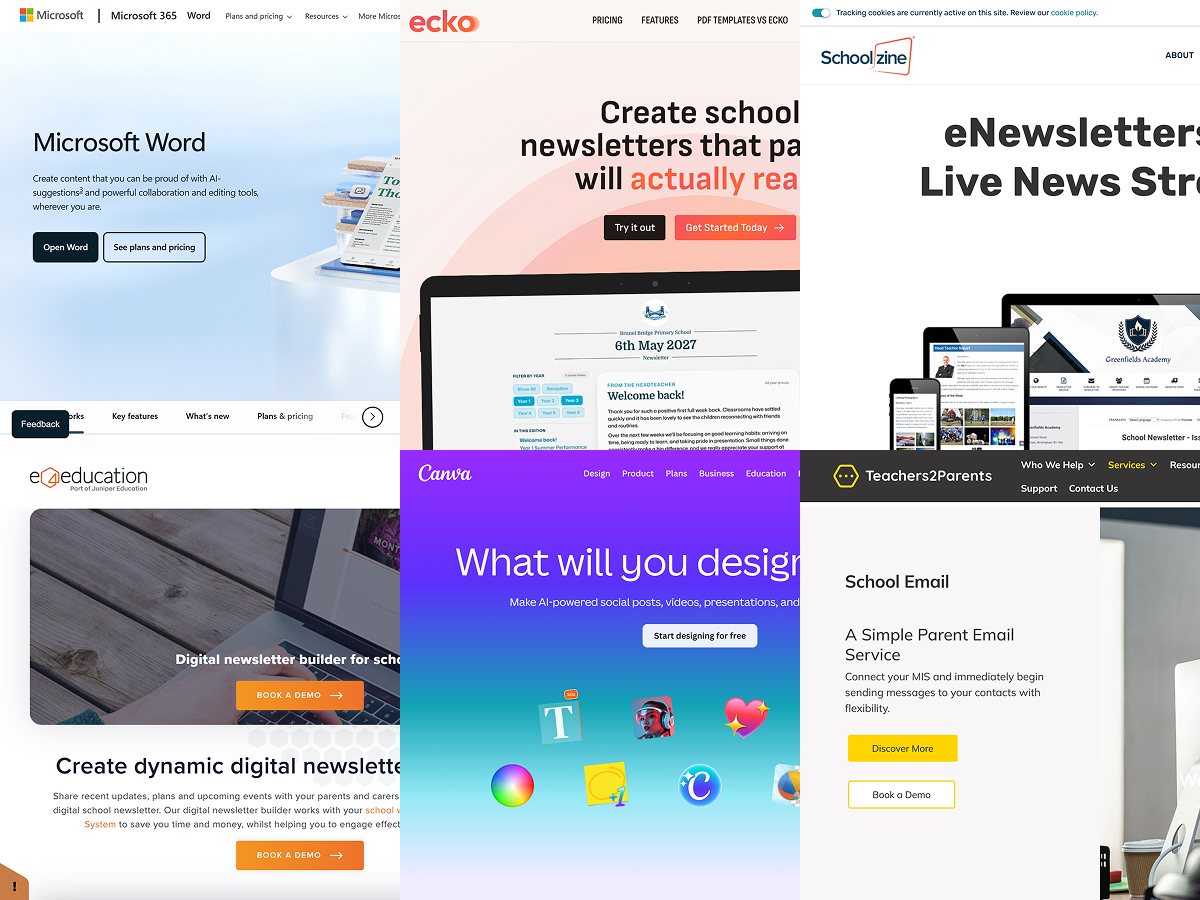
Once I started thinking about why, the problem seemed fairly obvious. Like a lot of school newsletters, it was being sent out as a PDF. That works well enough if you are printing it out, but much less well on a phone, which is where most parents were actually reading it (a quick poll in the class WhatsApp group confirmed that). It meant zooming in and out, swiping around in all directions and trying to pick out the bits that actually mattered to your family.
Because I was looking at it both as a parent and as a web developer, it quickly felt like one of those problems that had a neat solution. The issue wasn’t that the school wasn’t communicating enough, or that parents didn’t care. The issue was that the format was getting in the way. A web-based newsletter could be easier to read, easier to navigate and better suited to how families actually consume this kind of information. And putting it on the web would mean it could be interactive, more relevant and more useful.
That was what prompted me to speak to the school and ask whether they would be open to working with me on something better.
Once we started talking properly, it became clear there was another side to the problem too. The newsletter was not just awkward for parents to read, it was awkward for staff to produce. Updates had to be gathered from different places, dropped into a cumbersome Canva template and then shuffled around until everything fit… then there’d be a last-minute addition and it was pretty much back to square one. It took time, and it made a routine communication job more fiddly than it needed to be.
That was the starting point for Ecko.
The aim was never to make school newsletters flashy or turn them into some huge new platform. It was simply to make them work better. Better for parents and better for the people in school office who have to get them out every week.
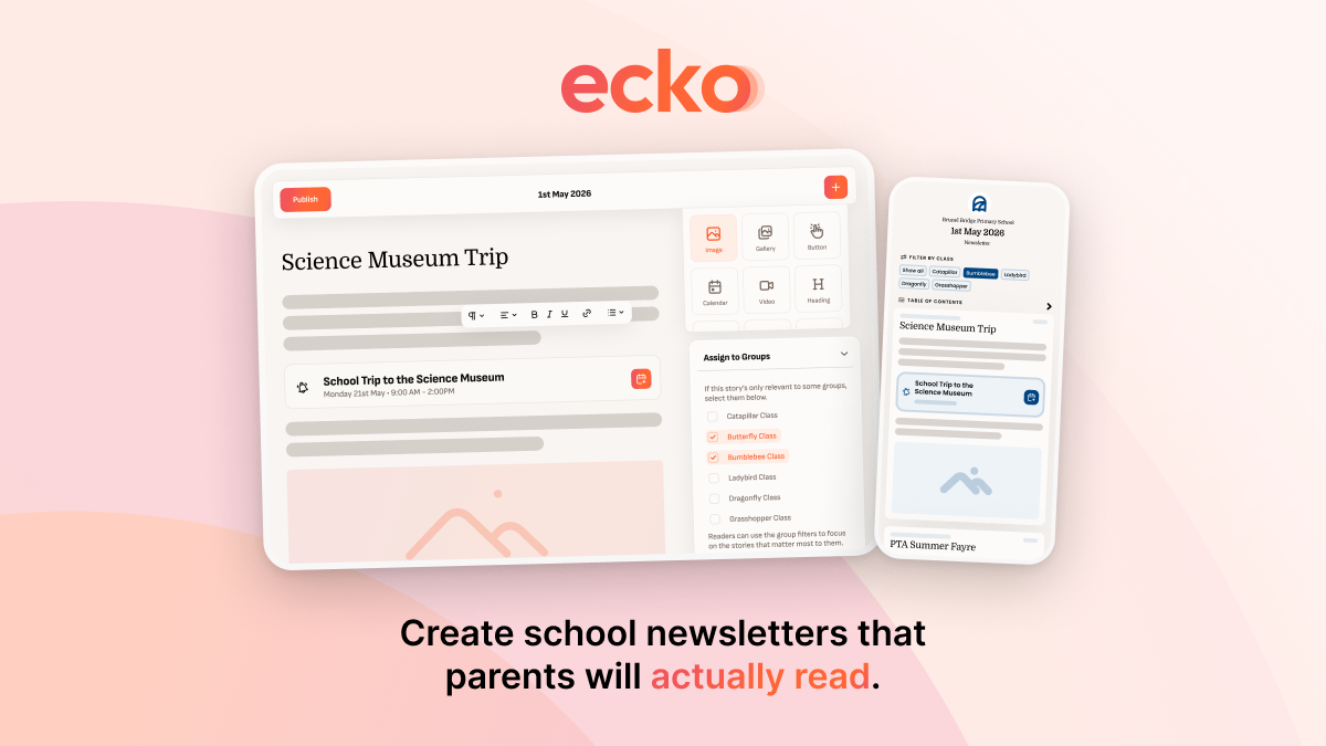
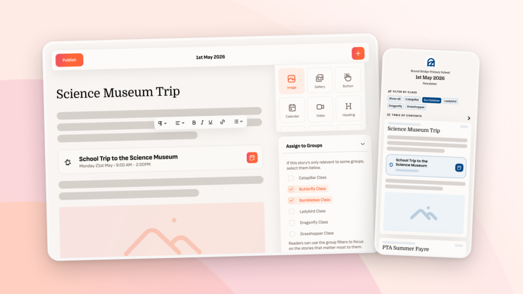
So Ecko was built in collaboration with a real school, with constant input from the people actually using it. That shaped the product just as much as the original idea did. Some of the early thinking was about the reading experience: making newsletters easier to browse, easier to come back to and easier to make sense of. But a lot of what made Ecko properly useful came from understanding the publishing side too: how to make it quicker to create editions, easier to re-use content and most importantly, no more wrestling with layout.
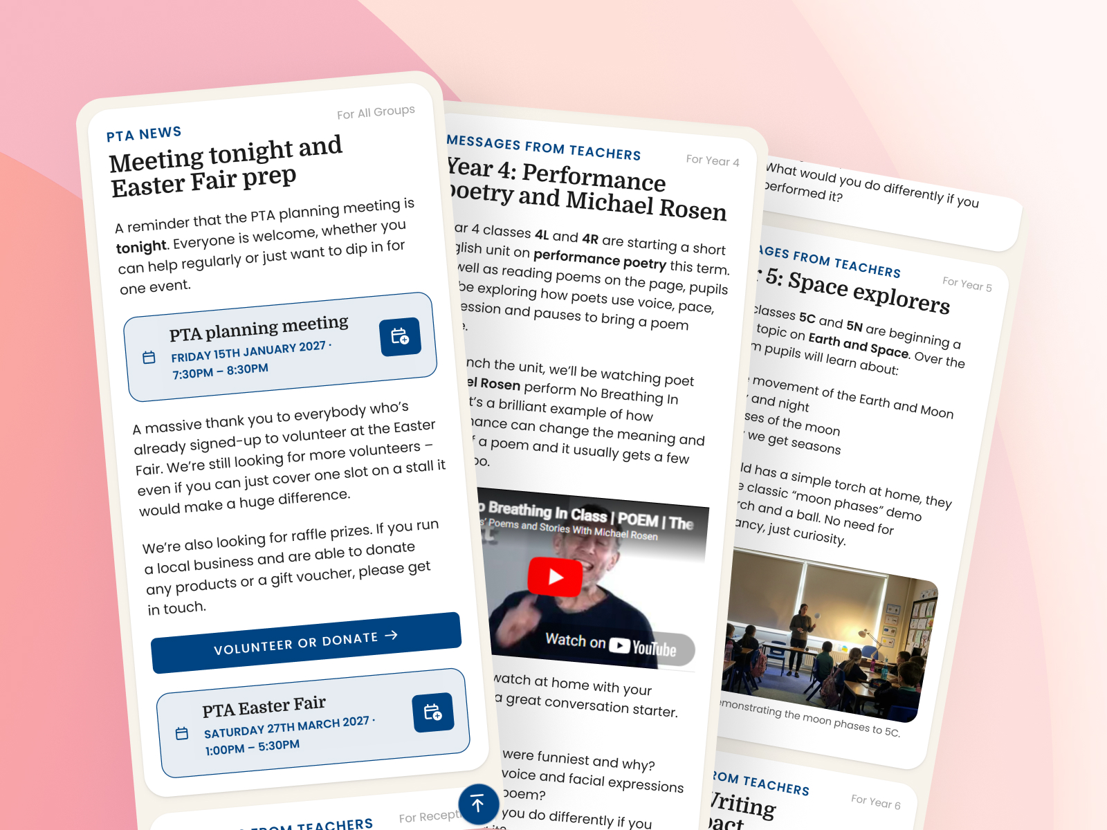
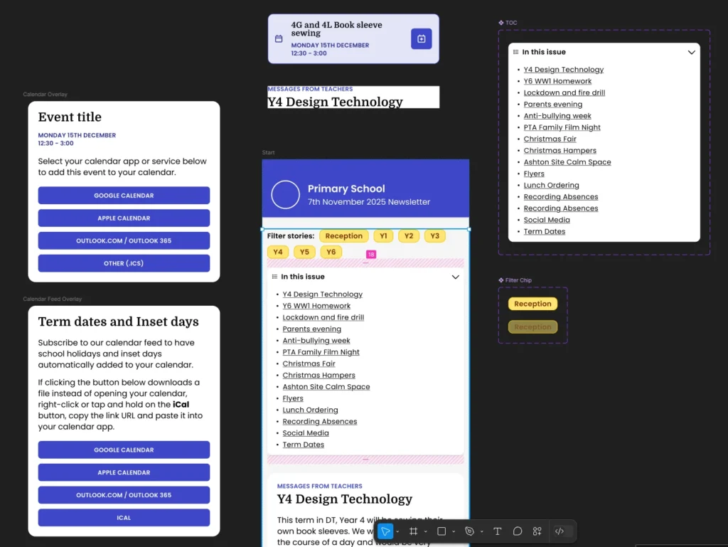
That is why Ecko works the way it does. Instead of designing each newsletter page by page, schools create stories and pull them into an edition. The layout takes care of itself. The finished newsletter works properly on phones, tablets and desktops and it allows parents to easily take action when they need to, like adding the summer fete to their own calendar with a couple of taps.
Over time, Ecko continues to evolve. We’re always coming up with new ways to make the newsletter more useful for parents and easier and faster for schools. But the principle we started with remains the same: School newsletters are important and we want to make it easy to create school newsletters that parents will actually read.
That is really all Ecko is trying to do, and it does it pretty darn well!